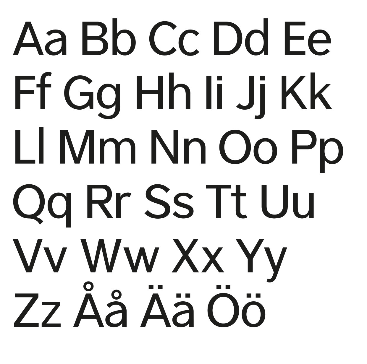
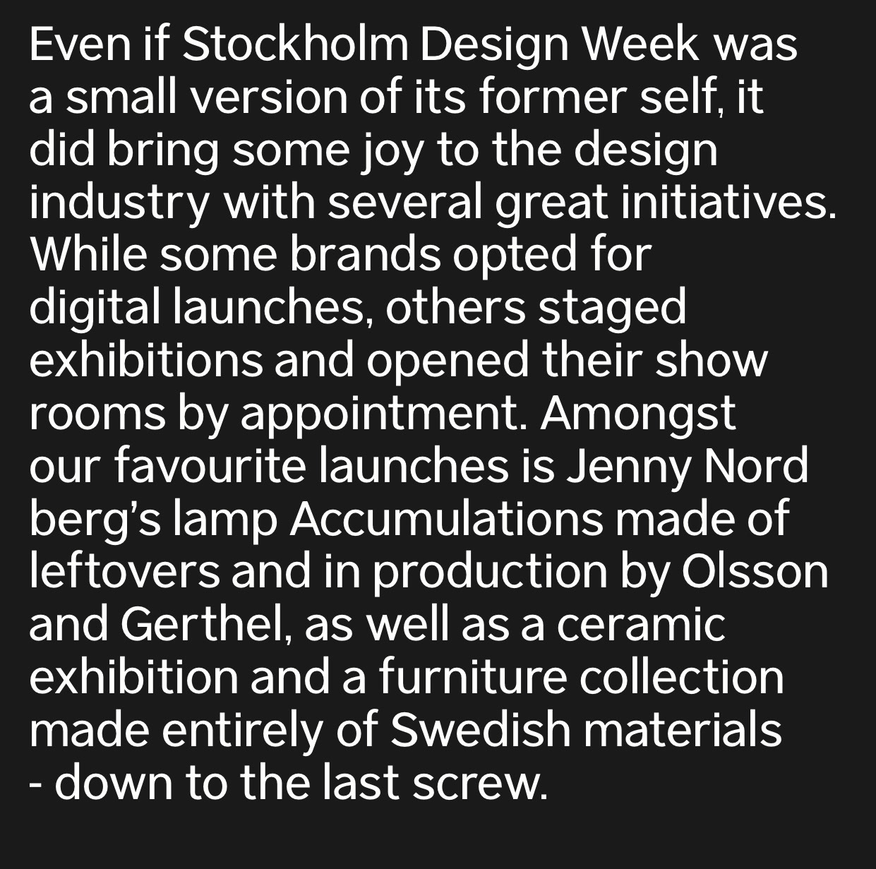
Central grotesk is my first typeface design. It is still a work in progress but it is a project that is particularly close to my heart. One of the things that sets Central Grotesk apart is the high x-height, the open terminals of the letters and the ascenders being taller than the cap height. I wanted to create a typeface that was clean and modern with a little bit of character. The result is a versatile typeface suitable for a wide range of applications.
Overall, this project have made a big impact on me and introduced me to the world of type design and I look forward to growing and refining my skills even further.